CSS3 web design background fade-out effect may take advantage of the photo camera, directly to fade into the background of the page effect, do not need to use graphics software can do, this technique is the use of CSS3 the Gradients gradient effect to deal with, in the background Adding background image and transparency and gradient processing in the properties can show the web page background fade-out effect. Web designers only need to adjust the color and transparency parameters to directly adjust the fade-out effect of the web page background image.
Here we have to use an original image as the background image of the webpage

CSS3 web page background fade-out effect example 1. When the transparency is 0
<style type="text/css">
body {
margin-top: 0px;
margin-right: 0px;
margin-bottom: 0px;
margin-left: 0px;
}
#container{
height:375px;
background:#fff;
background :linear-gradient(top,#ffffff,rgba(51,51,51,0)),url(original background image URL) center bottom no-repeat;
background:-moz-linear-gradient(top,#ffffff,rgba (51,51,51,0)),url (original background image URL) center bottom no-repeat;
background:-webkit-linear-gradient(top,#ffffff,rgba(51,51,51,0)), url(URL of original background image) center bottom no-repeat;
}
</style>
<body>
<div id="container">
...site content...
</div>
</body>
The actual fade out effectbody {
margin-top: 0px;
margin-right: 0px;
margin-bottom: 0px;
margin-left: 0px;
}
#container{
height:375px;
background:#fff;
background :linear-gradient(top,#ffffff,rgba(51,51,51,0)),url(original background image URL) center bottom no-repeat;
background:-moz-linear-gradient(top,#ffffff,rgba (51,51,51,0)),url (original background image URL) center bottom no-repeat;
background:-webkit-linear-gradient(top,#ffffff,rgba(51,51,51,0)), url(URL of original background image) center bottom no-repeat;
}
</style>
<body>
<div id="container">
...site content...
</div>
</body>
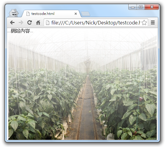
We use a top-down gradient effect in example one. The background color is white from the top (#ffffff) and gradually becomes gray at the bottom (rgba(51,51,51,0)), but we change The transparency of the gray part is set to 0, that is, the last parameter of rgba used to control the transparency is set to 0, so there is a white fog above the background image, but the bottom is clear, if you want to make the bottom also masked Then adjust the transparency of the gray part! Please see example two.
CSS3 webpage background fade-out effect example 2: When the transparency is 30%
<style type="text/css">
body {
margin-top: 0px;
margin-right: 0px;
margin-bottom: 0px;
margin-left: 0px;
}
#container{
height:375px;
background:#fff;
background :linear-gradient(top,#ffffff,rgba(51,51,51,0.3)),url(original background image URL) center bottom no-repeat;
background:-moz-linear-gradient(top,#ffffff,rgba (51,51,51,0.3)),url (original background image URL) center bottom no-repeat;
background:-webkit-linear-gradient(top,#ffffff,rgba(51,51,51,0.3)), url(URL of original background image) center bottom no-repeat;
}
</style>
<body>
<div id="container">
...site content...
</div>
</body>
The actual fade out effectbody {
margin-top: 0px;
margin-right: 0px;
margin-bottom: 0px;
margin-left: 0px;
}
#container{
height:375px;
background:#fff;
background :linear-gradient(top,#ffffff,rgba(51,51,51,0.3)),url(original background image URL) center bottom no-repeat;
background:-moz-linear-gradient(top,#ffffff,rgba (51,51,51,0.3)),url (original background image URL) center bottom no-repeat;
background:-webkit-linear-gradient(top,#ffffff,rgba(51,51,51,0.3)), url(URL of original background image) center bottom no-repeat;
}
</style>
<body>
<div id="container">
...site content...
</div>
</body>
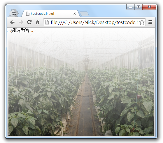
In the second example, the last parameter of the rgba in the first example is set to 0.3, which means that the transparency of the gray part is 30%. Compared with the first example, it is obvious that there is a little gray under the background image. , Both of these examples use the same clear background image. Through the Gradients gradient effect and transparency adjustment, the practical application of the web page background image fade-out effect is created. Designers can modify the example and the gradient in the method. Color and end color, and then adjust the transparency, you can change a variety of web page background fade effects, quite interesting and practical.

Post a Comment
0 Comments