The CSS3 border-image property allows the border of web page elements to be represented by pictures. It is usually applied to DIV blocks. Of course, border-image can also be applied to other elements, such as web button borders, but the border-image property is most commonly used. Still DIV block. It is not easy for traditional CSS design to add image border effects to DIV blocks. When CSS technology is developed to CSS3, it is easy to add image borders to DIV blocks through the border-image property , which will add richness. The visual effect is even easier.
Although the CSS3 border-image property is quite convenient and is also supported by most mainstream browsers, the old version of IE browser does not support the CSS3 border-image property. It did not support the CSS3 border-image property until the new version of IE 11, so border is being used When using the -image attribute, please carefully consider the designed web browsing group.
CSS3 border-image property integration syntax
border-image: source slice width outset repeat|initial|inherit;
There are many different items in CSS3’s border-image attribute integrated writing method, which are used to set the image source URL, image cutting, image width, relationship with the border and the filling method of the image. This integrated writing method is somewhat similar to the border attribute, of course these Projects can also be written apart and organized as follows.Various syntaxes of CSS3 border-image property
| value | Description |
| border-image-source | Image source URL. |
| border-image-slice | Divide the frame of the picture to be used into nine grids, and grab the four corner pictures. |
| border-image-width | Set the width of the picture border. |
| border-image-outset | The amount of the border image beyond the border. |
| border-image-repeat | There are three common parameters for setting the filling method of the picture.
|
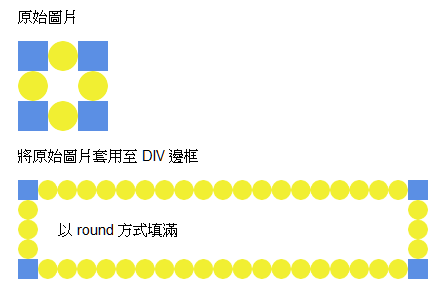
CSS3 border-image property example 1. Fill in round
<style>
div{
border:20px solid transparent;
width:330px;
padding:20px;
}
#DIV1{
-moz-border-image:url(picture URL) 30 30 round; /* Show Firefox*/
-webkit-border -image:url(picture URL) 30 30 round; /* Show it to Safari and Chrome*/
-o-border-image:url(picture URL) 30 30 round; /* Show it to Opera*/
border-image:url( Image URL) 30 30 round;
}
</style>
<p>Original image</p>
<img src="Image URL">
<p>Apply original image to DIV frame</p>
<div id="DIV1 ">Fill in round</div>
Effect of the examplediv{
border:20px solid transparent;
width:330px;
padding:20px;
}
#DIV1{
-moz-border-image:url(picture URL) 30 30 round; /* Show Firefox*/
-webkit-border -image:url(picture URL) 30 30 round; /* Show it to Safari and Chrome*/
-o-border-image:url(picture URL) 30 30 round; /* Show it to Opera*/
border-image:url( Image URL) 30 30 round;
}
</style>
<p>Original image</p>
<img src="Image URL">
<p>Apply original image to DIV frame</p>
<div id="DIV1 ">Fill in round</div>
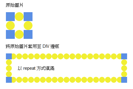
CSS3 border-image property example two, fill in the repeat method
<style>
div{
border:20px solid transparent;
width:330px;
padding:20px;
}
#DIV1{
-moz-border-image:url(http://www.wibibi.com/upload/20150113225637.png) 30 30 repeat; /* Show Firefox*/
-webkit-border-image:url(http://www.wibibi.com/upload/20150113225637.png) 30 30 repeat; /* Show Safari and Chrome*/
-o- border-image:url(http://www.wibibi.com/upload/20150113225637.png) 30 30 repeat; /* Show to Opera*/
border-image:url(http://www.wibibi.com/upload /20150113225637.png) 30 30 repeat;
}
</style>
<div style="font-size:15px;">
<p>Original image</p>
<img src="http://www.wibibi.com /upload/20150113225637.png">
<p>Apply the original picture to the DIV frame</p>
<div id="DIV1">Fill in the way of repeat</div>
</div>
Effect of the examplediv{
border:20px solid transparent;
width:330px;
padding:20px;
}
#DIV1{
-moz-border-image:url(http://www.wibibi.com/upload/20150113225637.png) 30 30 repeat; /* Show Firefox*/
-webkit-border-image:url(http://www.wibibi.com/upload/20150113225637.png) 30 30 repeat; /* Show Safari and Chrome*/
-o- border-image:url(http://www.wibibi.com/upload/20150113225637.png) 30 30 repeat; /* Show to Opera*/
border-image:url(http://www.wibibi.com/upload /20150113225637.png) 30 30 repeat;
}
</style>
<div style="font-size:15px;">
<p>Original image</p>
<img src="http://www.wibibi.com /upload/20150113225637.png">
<p>Apply the original picture to the DIV frame</p>
<div id="DIV1">Fill in the way of repeat</div>
</div>
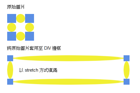
CSS3 border-image property example three , fill it with stretch
<style>
div{
border:20px solid transparent;
width:330px;
padding:20px;
}
#DIV1{
-moz-border-image:url(picture URL) 30 30 stretch; /* Show Firefox*/
-webkit-border -image:url(image URL) 30 30 stretch; /* for Safari and Chrome*/
-o-border-image:url(image URL) 30 30 stretch; /* for Opera*/
border-image:url( Image URL) 30 30 stretch;
}
</style>
<div style="font-size:15px;">
<p>Original image</p>
<img src="Image URL">
<p>Apply the original image To the border of DIV</p>
<div id="DIV1">Fill in a stretch method</div>
</div>
Effect of the examplediv{
border:20px solid transparent;
width:330px;
padding:20px;
}
#DIV1{
-moz-border-image:url(picture URL) 30 30 stretch; /* Show Firefox*/
-webkit-border -image:url(image URL) 30 30 stretch; /* for Safari and Chrome*/
-o-border-image:url(image URL) 30 30 stretch; /* for Opera*/
border-image:url( Image URL) 30 30 stretch;
}
</style>
<div style="font-size:15px;">
<p>Original image</p>
<img src="Image URL">
<p>Apply the original image To the border of DIV</p>
<div id="DIV1">Fill in a stretch method</div>
</div>

Post a Comment
0 Comments