The three-column web page layout design is a very common layout configuration method. The advantage is that there are more blocks in the web page, especially many different fields can be added to the sidebar. With the continuous popularity of CSS, the current web page Designers often use CSS DIV block planning to design tri-column web page layouts. Through the width, height, and floating techniques of each DIV block, with different background colors, you can easily plan the following The appearance of this three-column webpage, this article uses the source code of this example schematic to introduce how to use CSS DIV to design a tri-column webpage. The first thing to look at is the relatively simple HTML part, and then the slightly more complicated CSS syntax part. , But overall it is still the basis of CSS typography.
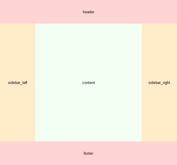
As shown in the three-column web page diagram above, we have planned several large blocks, which are the header area at the top, the sidebar_left and sidebar_right on the left and right sides, the content area in the middle of the page content, and the footer area at the bottom. footer, the following example grammar will tell you how to design such a web page layout.
HTML syntax structure
<div id="header">header</div>
<div id="sidebar_left">sidebar_left</div>
<div id="sidebar_right">sidebar_right</div>
<div id ="content">content</div>
<div id="footer">footer</div>
</div>
CSS syntax
#sitebody{
width:600px;
margin:0 auto;
font-size:13px;
}
#header{
background-color:#FFD4D4;
height:80px;
text-align:center;
line -height:80px;
}
#sidebar_left{
background-color:#FFECC9;
width:120px;
height:400px;
text-align:center;
line-height:400px;
float:left;
}
#sidebar_right{
background-color:#FFECC9 ;
width:120px;
height:400px;
text-align:center;
line-height:400px;
float:right;
}
#content{
margin-left:120px;
margin-right:120px;
height:400px;
background-color:#F2FFF2;
text-align:center;
line-height:400px;
}
#footer{
clear:both;
background-color:#FFD4D4;
height:80px;
text-align:center;
line- height:80px;
}
</style>
- float -DIV block float
- width-DIV width
- height-DIV height
- margin -the outer margin of the DIV block
- font-size -font size
- background-color -background color
- text-align -text alignment
- line-height -text line height
- clear -clear float
Just open a blank file, paste the CSS syntax in, and then paste the content in the HTML syntax structure, the order is CSS first, then HTML, and then save the file as test.html, open it with a browser, you can view it The schematic diagram of the three-column webpage example at the beginning of this article, in principle, can be displayed smoothly in mainstream browsers such as Chrome, FireFox, IE, Safari, and Opera. This is just a way to design a three-column webpage through CSS DIV. Of course, web designers have their own set of design methods, but the general principle is usually to use similar methods, DIV block configuration, DIV width, margin , float , Background ... etc. As long as you master these basic CSS concepts, you can flexibly design various tri-column web pages. Finally, want to know how to design a single-column webpage or two-column webpage? There are also two detailed introductions to compare with the three-column design.

Post a Comment
0 Comments